
Publication design.
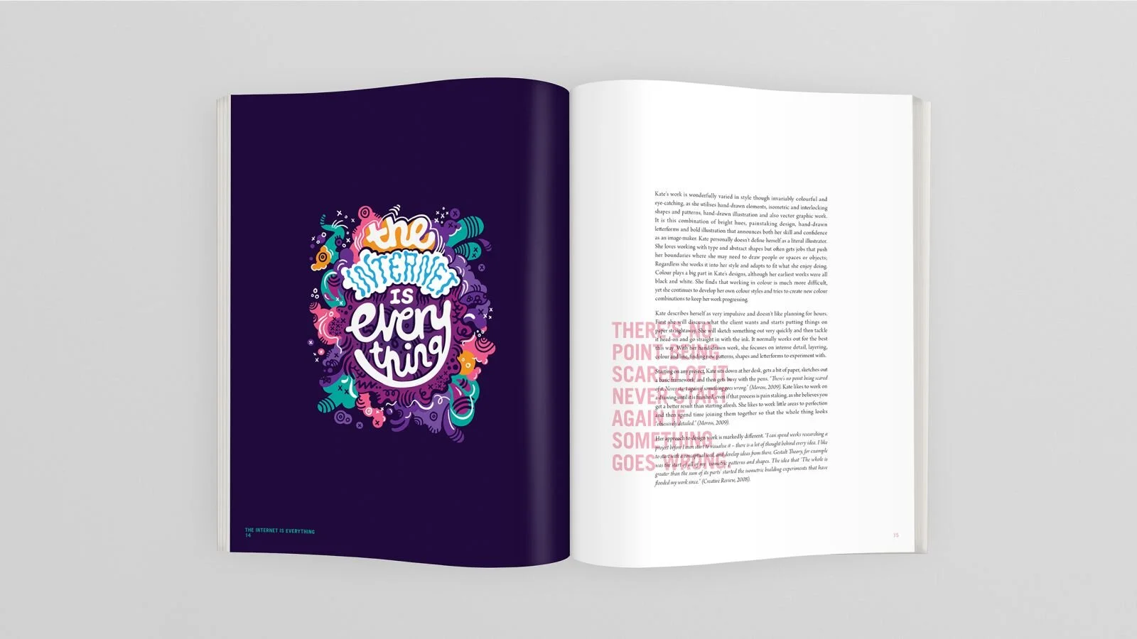
Three Sided Shapes was developed for a student brief requiring the design of an artist biography. The artist, Kate Moross, is a self-made illustrator, designer, photographer, and producer from London best known for her work with geometric shapes and ornate typography. The best source of inspiration for the project was the artist herself, therefore it was important to emphasize on the artist's use of bold colours and utilize this throughout the design.
With the artist's use of vivid colours in her work, there is only one image per page as to avoid overpowering the design; the solid coloured backgrounds of the artworks have been extended to the bleed line to add impact to the page.
As for typographic choices, a heavy sans was used for headings and quotes to complement the bold theme. To contrast this, a light serif typeface was used to offset the intensity of the design.
Headings have been positioned along the vertical center of the spread, creating an interesting look for some pages where they have overlapped paragraph text. An overlaid effect has been used to allow the article text to show through.